Последний отзыв
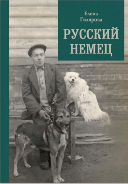
Русский немец

 2.83
2.83
Книга о трагической судьбе бывшего солдата германской армии, который остался в Советской России и в 1922 году женился на учительнице сельской школы. О...
Далее
По всем вопросам обращайтесь на: info@litportal.ru
(©) 2003-2024.
✖


Mapping Mars: Science, Imagination and the Birth of a World
Автор
Год написания книги
2019
Настройки чтения
Размер шрифта
Высота строк
Поля
Think of the commute that some of the USGS astrogeologists were making on a weekly basis between San Francisco and Los Angeles; like a few thousand people every day, I made it myself while researching this book. You come off the tarmac at San Francisco airport and wheel round over the South Bay; northern California drops away beneath you, views open up. By the time the plane is at its cruising altitude of 33,000 feet, the view has spread out across the state. The Coast Range beneath you is a set of soft creases in the earth’s crust, the Sierra Nevada a white rim on the horizon. After about half an hour’s flight at a fair fraction of the speed of sound, you start to drop down and pull out over the Pacific, then come back around into LAX. And if your plane could fly through solid basalt, that entire flight profile would fit easily inside the bulk of the volcano then known as Nix Olympica and now called Olympus Mons.
Olympus Mons is a softly sloping cone sitting on a cylindrical pedestal, a flattened lampshade on a 70mm film canister. The face of the pedestal is a cliff that circles the whole mountain and rises on average four or five kilometres above the surrounding plain. Stick that pedestal on to California and it would cover the centre of the state from Marin County in the north to Orange County in the south. The mountain’s peak, more than fifteen kilometres above the top of its surrounding cliff, would be high in the stratosphere, far above the reach of any passenger jet. You would be able to see it halfway to Flagstaff, a gently humped impossibility peering over the western horizon.
Yes, Olympus Mons is a mountain, built up by eruption after eruption of smooth-flowing basaltic lava. Yes, earth’s ‘shield volcanoes’ – like Ararat in Turkey, or Kilimanjaro in Tanzania, or Mauna Kea in Hawaii – were built in a similar way and have much the same profile. But the scale of the thing is incomparably grander. Mauna Kea, earth’s biggest volcano, would fit into the huge crater at the summit of Olympus Mons with room to spare. If you strung the arc of Japan’s home islands round its base the two ends wouldn’t meet; nor would the peak of Fuji clear the top of the great cliff that they were failing to encompass. An Everest on top of Everest would not come to the summit of Olympus Mons.
This single brutish Martian lump is larger than whole earthly mountain ranges. Its bulk – some 3½ million cubic kilometres of rock – is about four times the volume of all the Alps put together. If you wanted to build one on earth, you’d have to excavate all of Texas to a depth of five miles for the raw material – and you’d still be doomed to failure, because the planet’s very crust would buckle under the strain.
North Spot, Middle Spot and South Spot, stretched out along the ridge of Tharsis, are smaller than Olympus Mons. But not by much.
The great storm, rather than obscuring Mars completely, had in fact served to highlight its most dramatic features. It also set Sagan – always alert for lessons from other planets with relevance to this one – to wondering whether similar phenomena might have any relevance to the earth. Mariner 9’s infrared spectrometers showed that the dust did not just obscure the Martian surface from earthly eyes; it also chilled it by shielding it from the sun. In 1976 Sagan, his student James Pollack and other colleagues produced papers showing how the dust thrown into the earth’s stratosphere by large volcanic eruptions could cool the home planet in a similar way. Such cooling was to be put forward in the early 1980s as the mechanism by which a large impact by an asteroid or comet – an event guaranteed to kick up a lot of dust – might have killed off the dinosaurs. This new mechanism for mass extinction led to Pollack and his colleagues being asked to model the sun-obscuring effects of nuclear war, and thus to the idea of ‘nuclear winter’. Having gone to Mars to look for signs of life, Sagan found intimations of planetary mortality.
As the cooling planet-wide pall of dust started to ebb down the volcanoes’ flanks in late 1971, the television team began to pick out the outlines of other features: depressions, in which there was more airborne dust to reflect sunlight back into space, started to stand out as bright blotches. By the middle of December a vast bright streak had become visible to the east of the three Tharsis volcanoes. When the dust had settled out further the streak was revealed to be a set of linked canyons thousands of kilometres long and five kilometres deep. It would come to be called Valles Marineris after the spacecraft through which it was discovered. By the time the dust subsided in 1972, large parts of the planet’s northern hemisphere had been revealed as plains much more sparsely cratered than those over which the first three Mariners had passed. At the same time, other features known from earthly observation, like bright Argyre and Hellas, turned out to be the remnants of absolutely vast impacts.
Most striking of all, particularly to Masursky, were the erosion features. In some places long, narrow valleys ran for hundreds of kilometres across the plains with few if any tributaries. In other regions there were branching networks of smaller valleys, suggestively similar to those that drain earthly landscapes. And elsewhere mere were vast, sweeping channels that seemed to have torn across the crust with unbelievable force, scouring clean areas the size of whole countries. Had water done this? Masursky seemed sure of it and waxed lyrical on the planet’s lost rains to journalists; Murray looked on, grinding his teeth. After all, this was an alien world of new possibilities. Streams of lava might have been responsible – or torrents of liquid carbon dioxide, or gushing hydrocarbons, or slow-grinding ice. Even the thin winds were suggested as possible scouring agents – and though that was a spectacular stretch, it was increasingly clear that wind did indeed play a large role in the way the planet looked. Everywhere there were streaks where dust had revealed or hidden the surface beneath; in some places there were full-blown dune fields. The seasonal changes observed from the earth and held by some to mark the spread of primitive vegetation – changes that would have been Mariner 9’s primary focus, had its sister ship, Mariner 8, not fallen into the Atlantic just after launch and thus bequeathed the main mapping mission to its sibling – were now explained by the wind, at least in principle.
And there was yet more for Masursky and Murray and their colleagues to wonder at and argue over. Strange parallel ridges and lineations running in step for hundreds of kilometres. The collapsed chaos features seen by Mariner 6, which now appeared to be sources for some of the great channels. Rippling bright clouds of solid carbon dioxide (such clouds, streaming off the heights of Olympus Mons, provided the intermittent bright white expanses that made Schiaparelli think of snow and call the area Nix Olympica). Most strikingly, there were regions at the poles where the interaction of wind-borne dust and expanding and contracting polar caps had built up a weird, laminated terrain. Each layer must correspond to a different set of conditions – different wind patterns, different climates. Millions, maybe billions of years of history were there in those layers, just waiting to be read if only you could get to them and figure out what made them. Murray, in particular, found these polar layered terrains fascinating. Thirty years on he still does. He was to be part of the science team on the ill-fated Scott and Amundsen microprobes that accompanied Mars Polar Lander.
The twenty-four people working shifts on the television team had more than enough data to keep them happy. Every twelve hours a new swathe of pictures would come back, covering the planet in seventeen days. There were always new things to see, new things to think about, new things to ask for close-ups of at the next opportunity. And in the end Mars’s rocky surface was stored in their computers and tacked up on their walls, almost seven gigabytes of data, 7329 images. Mars was now much more than one of Tennyson’s points of peaceful light – it was taking on, in Auden’s words, ‘the certainty that constitutes a thing’. It could be measured in detail, and properly mapped.
(#ulink_97e87612-7c85-5a31-93a7-7ae7b81a0dd4) The excellent Australian film The Dish goes some way to redressing this oversight.
The Art of Drawing (#ulink_073d3198-5e8c-5040-95ef-150582faaa58)
How wonderful a good map is, in which one views the world as from another world thanks to the art of drawing.
Samuel van Hoogstraten, Inleyding tot de Hooge Schoole der Schilderkonst
(translated in Svetlana Alpers, The Art of Describing)
In 1959 Patricia Bridges, a gifted illustrator with a degree in fine arts, started making maps of the moon for me Air Force Chart and Information Center in St Louis. Her technique soon established ACIC as a better moon-mapping outfit than its great rival, the Army Map Service. But St Louis was not a particularly good place from which to see the moon and, though mapping from photographs was possible, direct observation was better. The ever-changing smearing of the atmosphere made it almost impossible for 1960s cameras to capture the moments of clarity in which the moon’s features are best seen – but the well-trained human eye could seize such brief impressions, understand what was seen in them and remember it. Through a good telescope eyes as keen as Bridges’s could gauge lunar details as little as 200 metres across, more than twice as acute as the resolution in photographs.
The mappers wanted that clarity and so they needed regular access to a good telescope. The twenty-four-inch telescope that Percival Lowell had built in Flagstaff with which to look at Mars was one of the best available, benefiting from high altitude, clean skies and clear nights. So the Air Force moon mappers moved to the Lowell Observatory, settling in permanently in 1961. They were based in a small cabin – previously a machine shop and lumber store – just a hundred metres or so from the observatory’s dome. By observing the same features lit from different angles on the waxing and waning moon, Bridges was able to get a sense of the features’ forms that a single photograph could never give. Sometimes she would sit there working on her maps night after night until the seeing was just so, at which point a colleague inside the dome would call her on the telephone and she would bundle up in her coat and run over to the telescope to capture some new detail of her subject.
In the mid-1960s, with the Apollo programme a national priority, the Flagstaff operation blossomed. More than half a dozen cartographers were trained in Bridges’s technique for lunar shaded-relief mapping. Shaded relief is a way of using heavier tones to suggest the shadows of hills and ridges on a map, giving the eye a sense of the third dimension. There are plenty of ways of doing the shading – with pencils, with paint, with chalks, even through a rather cumbersome system of embossing the relief on to plastic sheets and then photographing them lit from the side. But for the most part these are used to add shading to maps in which the relief is already clearly known through surveying, maps on which the topography is already defined by contours.
For the moon mappers the shadows with which they defined the landscape’s features were not an evocative extra to ease interpretation or please the eye. They were the essence of the map, the ultimate expression of the surface’s form. As such they needed to be rendered with minute fidelity, and the tool of choice was the airbrush, capable of capturing both the finest details – which is why people who retouched photographs relied on it in the days before Photoshop and similar software – and producing precisely graded washes, which was what commercial artists liked about it. There are other ways of producing maps of the planets: using Mariner 9 pictures and Mert Davies’s control net, a British astronomical artist called Charles Cross did a very pretty and accurate set of maps using pencil and charcoal. These were used to make the first ever comprehensive atlas of Mars, with text by Britain’s leading populariser of astronomy, Patrick Moore. Cross’s work was fine; but compare it with the far greater precision of Bridges’s moon work and you see immediately why, when the USGS started planning the production of official maps of Mars, the airbrush technique would have been the obvious one to use even if its leading proponents had not been located in the same town as the USGS astrogeology branch. Ray Batson, the USGS cartographer whom Masursky had chosen to run the map-making team, made recruiting Bridges, who had left the Air Force mappers in 1968 but still lived in Flagstaff, one of his first priorities.
Another recruit from the Lowell team was Jay Inge. Inge had been a keen stargazer from boyhood on, but bit off more than he could chew, mathematically, when he enrolled for physics and astronomy at the University of California, Los Angeles in the 1960s. After the first semester he was ‘casting around for things to do’ and ended up taking a degree in bio-medical illustration. Then he heard from a friend – one of his childhood telescope buddies – about what was going on at the Lowell Observatory. The moon mappers needed his illustrating skills and they offered a way back into stargazing. So Inge joined the team at Lowell.
Inge augmented the techniques Bridges had developed in various subtle ways. One particular gift he brought was a dexterous use of the powered eraser, not to get rid of errors – ‘an eraser is never used to rescue a poor drawing,’ he wrote sternly in a manual on shaded relief mapping – but as a technique for highlighting things. This was, in a way, an adaptation to the airbrush of the ‘dark plate’ map-making technique that was then sometimes used for charts of the ocean floor; dark plates double illustrators’ options by allowing them to both add and subtract from what was on the page to begin with. By taking ink away from the airbrushed original with a trusty K&E Motoraser, the illustrator could clarify and accentuate fine details, especially in the more deeply shaded parts of the maps.
By the time they made a start on the Mariner 9 images Bridges and Inge were highly accomplished, and the techniques they had developed for the moon were being taken up elsewhere. Inge had a fair amount of experience with Mars, too; while at Lowell he compiled telescope observations into a number of ‘albedo’ maps that showed the light and dark markings familiar for centuries (albedo is an astronomical term for the brightness with which an object reflects sunlight). But the spacecraft data offered new challenges. The television images from Mariner 9 were far better than any previous pictures of Mars, but they were very poor compared with the best images of the moon seen from the earth. (Even those observations were not as good as the pictures taken by the high-resolution camera designed for national security work that flew on board the Lunar Orbiter missions, which in the late 1960s overtook airbrush work as the state of the art for lunar mapping.) And with Mars there was no running up to the telescope in the middle of the night to get a better look. It wasn’t all the spacecraft’s fault: Mars was not a terribly good photographic subject. Its surface was pretty uniformly dark, and even after the great storm of 1971 had died down the atmosphere carried a residual obscuring burden of dust, not to mention occasional clouds.
The pictures were a lot less than ideal. Their saving grace, though, was that they were stored in a digital format. And even in the 1970s, there was a lot you could do with digital data to make it look better. The distortions in shape and brightness due to the design of the TV tubes could be dealt with. So could the after-image effect caused by the fact that vestiges of the previous picture would be mixed in with the current one. (If all this makes the cameras sound bad, well, they were: but they were also the best that could be sent to Mars.) Contrast could be increased spectacularly with new image-processing algorithms which massaged the data so that small variations in brightness were exaggerated into large ones. The computers could also ‘rectify’ images in which the camera had been pointed off at an angle, rather than straight down, putting them into a form suitable for mapping. Points from Merton Davies’s control net would be identified in a set of pictures and a graph would be created that showed how those points would be arranged in a given map projection. Then the image files would be stretched and squashed until the control points in the images matched the pattern prescribed in the idealised graph. An easy way to check that the system was working correctly was to look at the shapes of craters before and after. In pictures the spacecraft had taken at an angle, perspective made the craters on the surface look elliptical; in pictures the computers had given a correct projection, they were circular.
This time-consuming process produced ‘photomosaics’ with their proportions corrected and their features enhanced. But these mosaics still had their shortcomings. Some of the individual images that made them up would be darker than others, giving a sort of fish-scale effect to the assemblage. The images would also have been taken at different times of day and thus different pieces of the landscape would be lit from different directions – confusing to the inexpert eye and irritating to the expert one. Imperfections in the control net squashed and stretched some areas (in the case of the north polar region the small number of distinctive landmarks was particularly problematic, and would cause Inge no end of grief). And many useful images were simply excluded. Much of the Martian surface had been visited repeatedly by Mariner 9’s cameras, but only one image of any given feature could make it into any given photomosaic. The others had to be left out, even if they offered extra information. In short, even when rectified, the primary Mariner 9 mosaics were ugly, confusing and less detailed than they could have been.
This was where the airbrush mappers came in: Bridges, Inge and their junior colleagues Susan Davis, Barbara Hall and Anthony Sanchez. They overlaid the photomosaics with Cronaflex, a Mylar film covered in a translucent gel on to which they would apply their ink. For the most part – different mappers had different styles – they would first trace the obvious features, such as rims of craters and edges of valleys, then start to work in the detail. As well as looking through their working surface at the mosaic beneath, they would also look at any other pictures they had that showed the same features. They built up a mental image of the forms they were trying to portray, their imaginations reaching into the images for detail, their discipline pulling them back from self-delusion.
(#ulink_5709ba90-9f25-5c12-8b42-00b57e293675) They made their Mars in their minds and their airbrushes whispered it on to the Cronaflex. The concentration required was phenomenal. Ralph Aeschliman, the only airbrush artist still working at Flagstaff in 2000, likened it to being a bathroom plunger stuck to a television screen: ‘If you got interrupted there was this schwooup noise as you tore yourself away.’
Making the maps was a way of working through the data, one that did so in images rather than words. Inge talks of it as an act of interpretation, a way of precisely describing the television team’s data. But these were not just descriptions; they were pictures. Indeed, to some they were art. Aeschliman was scraping a living as a landscape artist in the Pacific north-west – he had an intriguing style that drew on Chinese influences – when a reawakened interest in astronomy led him to buy some of the USGS maps in the mid-1980s.
(#ulink_45ab4787-a9c2-5c90-80ff-e32c3db11410) ‘I’d always hated airbrush art – it was always so slick – but in those maps it was like dancing. It’s hard to describe – very disciplined but very free too, the representing of a mental landscape built up from source material that’s very scattered and different.’ When his rent increased three times in a year, he decided it was time to head for warmer climes and clearer skies in the south-west. When he got to Flagstaff, he came to the USGS and asked for a job.
Aeschliman was instructed in the planetary mappers’ technique by Bridges – ‘There were times when I thought I’d just never be able to do it’ – but his greatest respect was reserved for Inge. ‘He was very spontaneous. He worked very rapidly and his work sort of sparkles. It has a presence.’ Inge, now confined to a wheelchair by multiple sclerosis and myasthenia gravis, is flattered when I remind him that Aeschliman thinks of him as an artist. Though his living room walls are decorated with expressive abstracts he’s painted, Inge claims to set little store by them. ‘I’m a dabbler; I don’t think I qualify as anything better than a good motel artist.’ But then Inge didn’t set out to be an artist; he was always set on being part of the research programme itself. So while he plays down any pride that he takes in the obvious artistry of his maps, he is happy to boast about the projects they have made him part of. ‘Of the twenty-five mappable surfaces in the solar system – the solid planets and moons we’ve visited – I’ve worked on eighteen of them.’
Of all those surfaces, Mars had the most time and ink devoted to it. In 1971 Batson and Masursky decided that they would cover the whole planet at a scale of one to 5 million – fifty kilometres to the centimetre, a scale at which the smallest features identifiable in the Mariner 9 data would be just discernible. To make the work manageable, the surface was cut into thirty pieces, known as quadrangles. Pat Bridges mapped an astonishing eleven of them; Hall, Davis and Sanchez between them did another twelve; Inge did seven as well as maps and globes of the whole planet. He also oversaw the production process, imposing rigorous quality control, doing the half-tone separations personally, flying to the survey’s presses in Reston, Virginia to supervise the printing and making ‘an obnoxious little shit’ of himself. The series was not finished until 1979, eight years after Mariner 9 arrived at its destination. But the final result is magical. These are maps to lose yourself in, like windows in a spaceship’s floor. They seem at the same time transparent to the truth and dense in artistry. They combine the presence of that which is real with the power of that which is inscribed.
The 1960s and 1970s were a great time for mapping. The space age was coming home to roost: the earth, that always-inhabited, always-experienced world, was being made over into an objectivised planet just like its neighbours, a minutely measured ball of rock and water. In the 1960s Argon spy satellites, offshoots of the Corona programme with cameras optimised for map making, were used to produce vast mosaic maps of poorly surveyed Africa and Antarctica. Other satellites were busily tightening up a global control net far more sophisticated than the Martian one, refining humanity’s knowledge of the shape of its world so that missiles would more easily be able to find their targets. The needs of the nuclear submarines from which those missiles would be launched, along with the interests of a new generation of earth scientists, were driving new studies of the earth’s ocean floors; while detailed data on the ocean depths were highly classified, beautifully drawn maps based on those data allowed earth scientists to see the spreading ridges and transverse faults central to new ideas about plate tectonics.
But the earth, partly because of those submarine-hiding oceans, could never be mapped in its entirety in the way that Mars was. Nor could it be mapped with such supreme disinterest. Earthly maps are heavy with duties to property and strategy, duties which can warp and distort them. On Mars everywhere was alike; nowhere was rich, or strategic, or owned, and so a pure disinterest reigned. There was a political point in their publication – these were American products, based on American ingenuity, printed by the American government – but in the images themselves there was nothing but the data, the interpretation and the artist’s style.
Though they were in some sense less faithful to the truth of the planet than the television images they were based on, the maps were far more approachable, especially for the layperson.
(#ulink_f7edbfb4-eedb-513d-b01e-766f9ecfbf2d) They had a feeling of naturalism that the other forms the data were presented in lacked. Like most naturalism, this was highly contrived, depending on a number of strict conventions. Tricks of shading were used to make sure the users’ eyes saw craters as dimples, not domes (an inside-out illusion endemic in photographs of planetary surfaces). The regional differences in the surface’s albedo – the curves and blotches which are all that you can ever see of Mars through any earthly telescope – were suppressed. Mars’s albedo was controlled not by the nature of its surface features but by the way the wind blew dust around and over them (the dusty bits were bright – the bits swept clear were darker), and winds were not something the mapping project was interested in. Inge developed a clever way of making separate albedo plates so that the maps could be printed with regional patterns or without, but after a few quadrangles the effort was given up. Nor was the colour on the final prints – a soft, light-brownish pink – the real colour of Mars. It was a colour chosen by Inge just to give a feeling of Mars. And somehow it did. The maps are indeed, as Inge always insists, technical documents that happen to have been drawn up in pictures, not words. But they were something more, too. After the maps were made, the real Mars was not only a surface under the spacecraft’s circling cameras. It was also something directly available to, and through, human minds and eyes and hands.
Sadly, mapping Mars descended from being a delight to being a chore. Almost as soon as the first series of one to 5 million maps was finished, it was decided to revise them using new pictures taken by the Viking orbiters which had reached the planet in 1976. The original artwork was pulled out of storage and reworked on the basis of the new data. Because the control net had evolved, features had moved a bit and fudges had to be made. New detail was added, but in some cases the resulting maps looked cluttered and confusing. Inge was no longer checking the presses and the colours became less subtle. Frictions between Inge and Batson took their toll. Bridges retired in 1990; Inge left in 1994 and became embroiled in litigation with the Survey on the basis that his medical condition was unreasonably used to prevent his re-employment in 1997.
The airbrush artists were not replaced. Batson saw that new computer systems could make photomosaics ever more maplike – the Mars Digital Image Mosaic 1:2 million series he oversaw the creation of is now the basic reference for almost everyone who studies the Martian surface. The topographic mapping of the planets is now almost entirely a matter of image processing. This has not banished beauty. In the late 1980s a geologist named Alfred McEwen produced some magnificent views of large reaches of the planet on the computer while at Flagstaff. An image he made of the western hemisphere – the ridge of Tharsis volcanoes close to the limb, the gash of Valles Marineris across the centre, the thin trace of Echus Chasma running thousands of kilometres towards the north like a gold highlight – may be more widely circulated than any other picture of the planet. It is to Mars what Harrison Schmitt’s endlessly reproduced picture of east Africa, the Indian Ocean and Antarctica, taken during the Apollo 17 mission, is to the earth. But though they can be beautiful and highly accurate – on such work you can improve things pixel by pixel if need be – the computer images lack the intimacy of the airbrush. By 2000 the late-comer Aeschliman was the only old airbrush hand remaining at the Survey’s Flagstaff branch and he was doing his work entirely on screen. There is still an airbrush on the premises somewhere, but there is no longer any compressed nitrogen to bring it to life.
The maps themselves, scarred by revisions, sit in storage. All, that is, except one. Late in 1972, according to Jurrie van der Woude, who looked after some of the logistics of the Mariner 9 pictures and has been doing similar things at JPL ever since, Bruce Murray pleaded for a copy of the one-sheet shaded relief map of the whole planet that Batson’s team was making based on the Mariner data. Van der Woude called Batson in Flagstaff, who admitted that Inge and Bridges had finished the map. Plates of it were being made for reproduction. When it was released it would turn out to be big news – a page of its own in the New York Times, a British tabloid headline screaming ‘American Miracle – Map of Mars!’. But it was not yet released. Indeed, there were not yet any printed copies.
Van der Woude persisted; eventually Batson agreed to send the original over to Pasadena, as long as it came back swiftly. Van der Woude gave it to Murray with dire imprecations that it must, but must, be returned in two days. Three days later van der Woude started to think that the normally friendly Murray was avoiding him.
It took a week or so for van der Woude to corner Murray and find out what had happened. Murray was an ambitious man; within a few years he would be the director of JPL. He had wanted the map to impress Harold Brown – then president of Caltech, later secretary of Defense. Brown had thought the map wonderful and asked to show it to a guest, Henry Kissinger. Kissinger, too, was impressed and commandeered the map in order to offer it as a gift to Leonid Brezhnev; in part, we can be sure, because the Soviet Union’s two missions to Mars in 1971 had failed, their pre-programming too rigid to allow diem to sit out the dust storm in orbit before getting to work, as Mariner 9 had done. And so the map had gone to the Kremlin.
(#ulink_986f940d-df71-549c-a004-031edef3d66e)
At least that’s Jurrie van der Woude’s story. Inge remembers that the map was lost, but not how. Murray says he remembers nothing of it – as does Harold Brown. Kissinger has proved elusive on the matter. So I have to doubt it. But I want it to be true. I want the first modern map of that planet to have played a role, even just a small one, in the history of this one. I want it to have reached the top. And I want it to have ended up where Jurrie says he last saw it, glimpsed in the background during a televised interview with a Russian space scientist, apparently taking pride of place on his office wall. I want it to be somewhere where it gets treated as an icon.
(#ulink_232c641e-0808-5364-9bd7-db46edc9927b) There were exceptions. Experience on the moon had led the mappers to treat odd features as craters until proved otherwise, so some Martian oddities ended up drawn as craters even when they weren’t. One of these non-crater craters went on to feature as a landmark in a rather good science fiction novel, Paul McAuley’s The Secret of Life.
(#ulink_9d7973e2-b544-56ce-8133-2b1dae21945a) It’s a nice coincidence that the father of astronomical art, Chesley Bonestell, was also much drawn to Chinese landscapes and delighted in being able to produce good enough examples of the genre to fool his friend Ansel Adams into accepting them as genuine.
(#ulink_f04aef2a-7bf7-54e4-9c36-3b54ec41a040) The other great cartographic products of the Mariner 9 mission, a set of ten-foot globes made at JPL through the painstaking hand-positioning of fragments of images on spherical surfaces, have a strange patchwork texture that makes them almost impossible for anyone but an expert to interpret.
(#ulink_5169721b-2c01-5263-8eaf-71ba6459645f) They were not the first planetary maps to get to the highest offices. Maps of the moon by the engineer James Nasmyth – better known for his steam hammer – so fascinated Prince Albert that he had Nasmyth present them to Queen Victoria, who was duly impressed.
The Laser Altimeter (#ulink_61fbc760-92b5-528c-a265-037731ba90d2)
Then felt I like some watcher of the skies
When a new planet swims into his ken;
Or like stout Cortez when with eagle eyes
He stared at the Pacific – and all his men
Последний отзыв
Русский немец
2.83
Книга о трагической судьбе бывшего солдата германской армии, который остался в Советской России и в 1922 году женился на учительнице сельской школы. О...
Далее